Announcement

Collapse
No announcement yet.

2022 Uniforms Thread

Collapse

Support The Site!

Collapse
X
 
  • Filter
  • Time
  • Show
Clear All
new posts

  • #16
    Originally posted by Matt Witwicki View Post

    The reason they have a white lid is likely because if they had a red helmet or black, you couldn't be able to see the logo clearly..as it would blend with the red or black as a base color....so they'd had to present the logo in a different way on the helmet....or the logo wouldn't stand out at all. I'm not sure they are looking to color-swap on the logo to make another helmet look work. Just a guess. I kinda like the white helmet look, as it doesn't seem many in the conference do that. It typically makes for a nice contrast with the red jersey, while also having red in the logo to tie it together. I think they could do a black jersey, while keeping the white lids..and have white pants....and it would be a different look for them.

    Who do you guys think has the best apparel/look in the NSIC....or maybe top 5?
    So, big surprise, my favorite uniform is the regular home uniforms for the Dragons, red jersey with the white trim, white pants and the helmet with the red facemask looks really good.
    https://dbukjj6eu5tsf.cloudfront.net.../9/14/web1.jpg

    If I had to pick other teams, though, my top five would be:

    Augustana- I think both the blue and gold jerseys look really great. The sword on the helmet is a nice touch
    https://goaugie.com/images/2020/7/8/...91116_2265.jpg

    https://goaugie.com/images/2022/8/15...jpg&quality=80

    UMD - I think the Bulldogs have a really sharp look. Good amount of gold in the trim and name on the front and I love the Champ mascot art on the helmet
    https://cdn.forumcomm.com/dims4/defa...ry_4649649.JPG

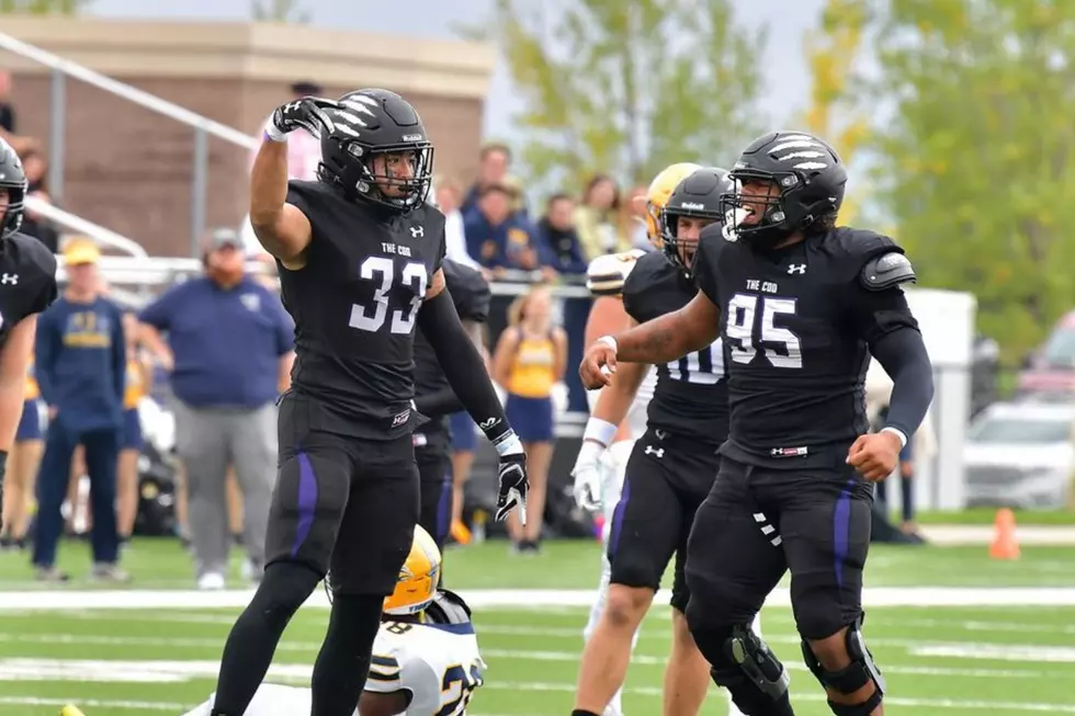
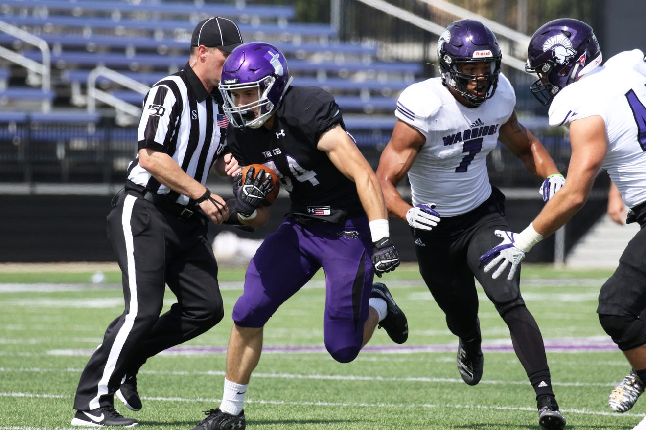
    Winona State - Really good, dark shade of purple. Simple, but clean look. The Warrior logo on the helmet is great, too.
    https://dbukjj6eu5tsf.cloudfront.net.../8/6/_5_71.jpg

    MSU Mankato - Probably the Vikings fan in me, but I love the Mavericks' look. The purple and gold really compliment each other and the logo featured on the helmets and the shoulders brings it together nicely. Nike always delivers.
    https://msumavericks.com/images/2017...ent_Corey1.JPG

    Concordia St. Paul - I think the pants would look better just blank or with a stripe than the words, but otherwise these uniforms look great. It's a very strong, dark blue, complimented nicely by the gold. The white helmets make the CSP block letters really stand out, too.
    https://dbukjj6eu5tsf.cloudfront.net...en_Kessler.JPG

    Comment


    • #17
      Originally posted by vikingfaithful View Post

      Agree with you on Mustangs brown tops gold pants. In my opinion one of best uniforms in the league.

      Would like to see the Mavs with an alternative helmet, Black Mav gets lost on dark purple helmet. Maybe a white or gold helmet.

      Really like UIU and BSU uniforms.
      Agree on Upper and Bemdiji !

      Comment


      • #18
        You may only view thumbnails in this gallery. This gallery has 1 photos.

        Comment


        • #19

          USF is certainly guilty of utilizing, heck even preferring recently, black even though the school colors are officially purple and white. When it's done right, I've been a huge fan. The all black look featuring jerseys that simply say "The Coo" are super clean. I love leaning into the Coo moniker. We need to do it more.


          The black jersey with purple helmets and pants may be my favorite of the current combos. But we need to go back to wearing all purple (below). Though the purple jesey could use a refresh. It was new when I was playing nearly a decade ago.


          Our away whites are pretty meh and not worth sharing. I do love the chrome puprle helmet with the shield from the university logo. It's a unique helmet using an academic logo feature instead of the athletic one that I think works. The black cougar scratch is also different. I like it. For more unique features we could try a city edition look using Sioux Falls' awesome city flag (Maryland crazy pehaps or check out Colorade State "State Pride" uniforms) or play off the falls. There's some unique opportunities there. I always wanted to do (and tried at one point) to do some Sioux Falls College Braves throwbacks with tomahawks on the helmet. Not gonna happen.
          4x 'Crackerjack' NAIA National Champions - 1996, 2006, 2008, 2009
          2016 NSIC Champions
          🔑🔑🔑🔑🔑🔑🔑🔑

          Comment


          • #20
            Plug for the Helmet Project if you haven't ever stumbled onto this site... http://www.nationalchamps.net/Helmet_Project/
            Lots of historical helmets to see from your favorite teams. The interlocking SF (knockoff 49ers logo) would be a great throwback for the Coo.


            The school color mention made find this resource as well... https://usteamcolors.com/university-...-falls-colors/
            Now I can get the true shade of purple.
            4x 'Crackerjack' NAIA National Champions - 1996, 2006, 2008, 2009
            2016 NSIC Champions
            🔑🔑🔑🔑🔑🔑🔑🔑

            Comment

            Ad3

            Collapse
            Working...
            X